

How can we make sense of thousands of data points collected during drug trials? It’s no easy task, but with the help of data visualization, the massive amount of data generated by clinical research begins to make sense. Let’s dive into the heart of this topic and discover how smart visualization techniques bring medical data to life.
Key Takeaways
- Visualization turns trial chaos into decisions. Clinical trials generate massive volumes of demographic, dosage, response, and safety data. Well-designed visuals (dashboards, Kaplan-Meier curves, forest plots, heatmaps) convert that raw output into patterns teams can act on, accelerating both protocol decisions and FDA/biologic approval reviews.
- Chart choice must match the question. Line and bar charts for trends and comparisons, Kaplan-Meier for survival, forest plots for meta-analysis, heatmaps for site or timepoint patterns, geographic maps for enrollment disparities, and interactive dashboards for real-time monitoring. Picking the wrong format obscures the signal.
- Good design is a credibility tool. Clean layouts, restrained color use, accurate axes, no 3D distortion, and clear highlighting of key findings preserve trust with regulators and clinicians. Visual integrity is non-negotiable in submissions.
- The hardest problems are upstream of the chart. Fragmented source systems, missing or delayed data, privacy constraints, demographic underrepresentation, and audit-trail requirements all shape what can legitimately be visualized. Interoperable data capture and validation protocols matter more than the visualization layer itself.
- AI and real-time analytics are reshaping the field. Predictive models flag enrollment risks and safety signals before they escalate, and patient-facing dashboards are increasing transparency and trial participation equity. Visualization is shifting from descriptive reporting to active steering of the trial.
What is clinical trial data visualization?
Clinical trial data visualization refers to the method of transforming complex medical datasets into clear, visual formats. This can be in the form of bar charts, heatmaps, interactive dashboards, and many more. For anyone involved in clinical research, these visuals become indispensable, no matter if they monitor breast cancer outcomes or track demographic representation in infectious disease studies.
Each trial generates multiple types of data:
- patient demographics;
- dosage timelines;
- response rates;
- adverse effects.
Without structure, these remain buried in spreadsheets. A well-crafted data visualization tool turns that mess into a map. Suddenly, it becomes possible to trace trial participation trends over time or compare black participant inclusion across geographic regions.
In oncology clinical trial design, for example, researchers often use timeline visualizations to monitor drug response phases. These visuals provide fast, data-driven decisions. They also streamline communication with stakeholders.
Clinical trial visuals also play a critical role in bridging gaps in demographic representation. Clear incidence data graphics can point out where participation rate lags in certain populations, offering a foundation for more inclusive trial design.
We can reap thousands of benefits from effective clinical trial data visualization. It can be a helpful assistant that follows the journey from data capture to biologic approval. [1]
The importance of data visualization in clinical research
Data visualization is already a requirement in clinical trials. With every trial generating thousands of datapoints from diverse sources, researchers need more than spreadsheets. They need a visual language to communicate insights clearly and fast.
In clinical research, data visualization drives better decision-making. It helps researchers monitor trial enrollment patterns and understand participant behavior in real time. When teams see participation data unfold over a timeline or across trial sites, they can spot red flags or opportunities quickly.
Take oncology clinical trials. These studies often collect detailed information across treatment cycles. Without visualization, a subtle trend in response rates might go unnoticed. But when layered into an interactive chart, a potential breakthrough becomes visible. That is how oncologists improve trial design and regulators move faster toward product approval.
Equitable research also benefits from data visuals. They expose gaps in demographic representation by mapping out black participant numbers or highlighting underrepresented age groups. Researchers can adapt outreach or redesign trial criteria to balance participation rates across groups.
When health equity becomes a design goal, visualization provides the roadmap. It connects data capture with inclusion outcomes. Tools that display incidence data by region or overlay trial participation across socioeconomic backgrounds offer not just clarity but accountability.
Effective visuals also speed up regulatory review. Regulatory agencies like the FDA require study data in clear, accessible formats. With proper data visualization tools, summary reports align with FDA approval standards, helping biologic approval move from data to decision. [2]
Key principles of effective data visualization
| Principle | What it means in practice |
|---|---|
| Know your audience | Clinicians need timeline trends and response rates. Regulators need safety metrics. Lay readers need plain framing. |
| Keep visuals simple | Drop chartjunk, gridlines, and decorative backgrounds. Clean design boosts comprehension. |
| Choose the correct chart type | Line and bar for time or comparisons. Forest plots for meta-analysis. Heatmaps for incidence patterns. |
| Use color wisely | One color per category, soft tones to highlight critical metrics. Color guides attention, never overwhelms. |
| Highlight key data | Use contrast or position to surface disparities such as black participant representation or FDA approval metrics. |
| Ensure accuracy and clarity | Validate source data and labels before publishing. Flawed inputs create misleading visuals. |
Common types of data visualizations used in clinical trials

Every clinical trial involves complex datasets. To simplify them, researchers use specific visual forms that bring clarity. Each type offers unique strengths, which are pointed out below.
- Bar and line charts
Bar charts help visualize categorical comparisons, such as participation rate by region or treatment arm. Line charts show changes over time, like patient response curves or dropout trends during trial participation.
For example, a line graph could show how participant numbers from a particular ethnicity changed across trial phases. That’s crucial for improving health equity in medical research. These basic charts may seem simple, but their clarity makes them a foundation for most study data presentations.
- Kaplan-Meier survival curves
These charts dominate oncology clinical trial reports. They show the probability of survival over time. Researchers rely on them to evaluate treatment benefits, especially when comparing an oncology drug with a standard therapy. The curves offer instant insight into efficacy, making them vital for FDA approval decisions.
- Forest plots
Used primarily in meta-analyses, forest plots display estimates from different studies or subgroups. They work well in summary reports, particularly when comparing outcomes across demographic segments or trial sites. Forest plots reveal variation in incidence data or highlight effectiveness in specific populations.
- Heatmaps and scatterplots
Heatmaps help track patterns across trial sites or timepoints. A heatmap of adverse events across study arms might highlight risk zones. Scatterplots show correlations – useful in biologic approval studies where dose-response relationships matter.
- Geographic maps
These visuals show regional variation in trial enrollment or disease incidence. A map that layers participation data with access to trial sites exposes disparities. It also supports outreach strategies that promote health equity in underserved communities.
- Dashboards
Interactive dashboards combine visuals with live data. Sponsors and site monitors use dashboards to track trial metrics in real time. Tools like these have transformed how teams interact with data.
Each of these formats supports better storytelling in clinical trials. They connect raw data to decision-making when the right tools and software are integrated into the workflow. [4]
Tools and software for clinical trial data visualization
| Tool | Strength | Best fit |
|---|---|---|
| SAS Visual Analytics | Statistical depth at scale | Pharma teams aligned to FDA reporting standards, oncology programs |
| R (ggplot2, Shiny) | Open-source, fully customizable, reproducible | Biologic approval studies needing flexible endpoint and safety tracking |
| Tableau | Interactive geographic and trend visuals | Mapping participation rate and incidence data across regions |
| Power BI | Live dashboards, easy CTMS integration | Trial enrollment, site performance, internal summary reports |
| JMP Clinical | Automated safety and demographic reviews | Early-phase trials and real-time decision-making |
| Spotfire | Predictive analytics on large datasets | Complex oncology trials, multi-endpoint regulatory submissions |
Best practices for designing clear and insightful visuals
Graphic design 101 teaches us that well-crafted visuals mean better results in decision-making.
- The most effective visuals begin with a precise question. No matter if the goal is to reveal gaps in demographic representation or demonstrate a treatment’s effect over time, having a clear objective streamlines the design and ensures relevance.
- A clean and consistent layout further strengthens the message. Uniform fonts and thoughtfully placed legends help reduce visual noise. These subtle decisions add up, particularly in visuals used in FDA approval processes or final summary reports.
- Highlighting the key takeaway matters just as much as the data itself. Readers shouldn’t have to guess where to look. When showing trial participation disparities or sudden shifts in dropout rates, emphasize those areas with bold lines or callouts. These design choices ensure that urgent findings, such as low black participant inclusion or site-specific underperformance, stand out immediately.
- Avoiding visual distortion is non-negotiable. Exaggerated graphics can mislead even experienced reviewers. This means that 3D bar charts or skewed axes are off-limits. Clinical trial visuals must maintain proportion and integrity to preserve the trust of medical research communities and regulatory bodies alike.
- For interactive platforms, the ability to filter data by trial phase, site, or demographic subgroup can uncover hidden patterns. This interactivity proves especially useful in exploring participation data and identifying opportunities to advance health equity in underserved populations. However, even the most interactive visual must rest on a solid foundation – data accuracy.
- Verification is the final, critical step. Every visual should reflect the most recent and correct information available. A sleek dashboard filled with outdated trial enrollment data undermines its purpose. Before sharing insights, especially with regulators, sponsors, or public stakeholders, teams must confirm that every figure supports the claims made.
These practices ensure that visuals serve their ultimate purpose: making medical research more transparent and equitable. [7]
Challenges in visualizing clinical trial data and how to overcome them

Visualizing clinical trial data sounds straightforward until real-world complexity steps in. Clinical research produces vast, diverse datasets, and making them visually meaningful involves more than just charts. Researchers face obstacles ranging from fragmented data sources to regulatory scrutiny and deep-rooted equity concerns.
Data integration
One of the most persistent challenges is data integration. Trial data often comes from multiple systems: electronic data capture platforms, site reports, patient-reported outcomes, lab results, and more. When these sources use different formats, reconciling them into a single data visualization tool becomes a logistical burden. Without standardization, researchers risk creating visuals based on inconsistent or incomplete information. Overcoming this requires interoperable systems and data harmonization strategies from the earliest trial phases.
Data gaps
Missing or delayed data also poses a threat. A survival curve or demographic dashboard loses value if updates lag behind. In fast-moving studies like those focused on infectious disease outbreaks, outdated visualizations can delay decisions that affect lives. Automated data feeds and validation protocols help close this gap, as they guarantee real-time accuracy in dashboards used for study data monitoring or summary report generation.
Ethics and discrimination
Another complication lies in the need for clear and ethical demographic representation. Underrepresentation of certain groups remains a longstanding issue in trial participation. However, simply showing low inclusion rates is not enough. Visuals must contextualize the participation rate with incidence data and regional access barriers. Only then can they support strategies that promote health equity and meet diversity benchmarks expected for FDA approval and biologic approval reviews.
Privacy concerns
Privacy regulations create additional design constraints. Clinical trial participation data must be anonymized before it is shared visually, especially when broken down by site or individual traits. The process of anonymization can be an obstruction. It can reduce detail and blur significant data. To balance clarity and confidentiality, data visualization tools must allow users to view aggregated trends without exposing sensitive information.
Regulatory landscape
Finally, the regulatory environment adds pressure. Every graphic submitted for product approval must meet compliance standards. Tools used to create visuals must support audit trails, source documentation, and traceable calculations. A visual that seems informative but lacks a clear origin can be rejected outright by reviewers. Tackling this challenge starts with choosing platforms that are designed to make clinical research more open and easy to understand.
These barriers are real, but none are beyond resolution. With thoughtful planning and the right tools, researchers can turn these challenges into opportunities to create clearer and more impactful visuals. [8,9]
Case studies: Effective use of data visualization in clinical trials
Real-world examples show how data visualization transforms clinical research across fields like oncology, infectious disease, and chronic care. Well-designed visuals guide everything from trial enrollment strategies to FDA approval.
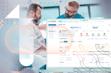
One standout example comes from BGO Software unveiling a sleek, high‑speed web dashboard that flips the script on how global trial teams work with data. They built an HTML5 front end powered by Kendo UI and wrapped it in a JSON API over an ASP.NET MVC/Microsoft SQL Server back end. Trial leaders filter by multiple attributes, run custom calculations, and flip from tables to charts with a click. The dashboard cuts back on server traffic and keeps data under lock with tiered permissions.
Clinical trial teams at sites around the world connect to the dashboard to track enrollment metrics and adverse events. They review lab results and patient‑reported outcomes side by side. Project leads set custom alerts that flag deviations from protocol thresholds, while monitors compare site performance with interactive charts. Sponsors drill down into patient‑level data using multi‑attribute filters and custom calculations. The dashboard pushes new information as soon as it enters the system, so everyone works with up‑to‑date figures. BGO’s case studies are just a glimpse of how useful this tech can be; check them out here. [10]
The role of AI and advanced analytics in data visualization
Artificial intelligence is a tool with a great impact in every sphere of life. It has the potential to change how clinical trial data gets visualized and understood. AI algorithms now scan massive study datasets quickly to detect patterns humans might miss, like hidden correlations in dropout trends or subtle safety signals across trial phases. These insights are shown in easy-to-read visuals, such as dashboards that update as new data comes in. This helps research teams see what is happening in real time and make faster, smarter decisions throughout the trial.
Advanced analytics also enhance predictive modeling. For instance, AI can forecast enrollment delays or identify trial sites likely to underperform based on historical data. When paired with data visualization tools, these predictions become clear visuals – color-coded risk maps, interactive timelines, and more. Together, AI and visualization don’t just describe clinical research; they help steer it forward with precision and speed. [11]
Future trends in clinical trial data visualization
Every field is evolving, and you may ask: “What is the future of clinical trial data visualization?”. Experts point out that processes are transforming to more automation and personalization. Emerging platforms now combine real-time data capture with predictive visual analytics, allowing sponsors to anticipate trial disruptions before they happen. These tools support faster decision-making, which is especially valuable in oncology drug development and infectious disease research.
We’ll also see broader use of patient-centric dashboards. These simplify complex study data for participants themselves, increasing transparency and supporting more equitable clinical trial participation. High-quality visuals will become central to product approval narratives, as FDA approval processes embrace digital formats. [12]
Enhancing clinical research with better data visualization
What good is data if no one can understand it? In clinical research, clear and thoughtful visualization turns complex trial results into insights that drive action. As tools evolve and AI grows smarter, researchers can visualize study data faster and with greater impact. We at BGO Software can help you to ease the process of visualisation, because we believe that better visuals strengthen clinical trial benefits for all.
Sources:
[1] Boina, R., & Achanta, A. (2023). The role of data visualization in healthcare analytics. International Journal of Advanced Research in Engineering Technology & Science, 10(9), 1. https://www.researchgate.net/publication/375282240_The_Role_of_Data_Visualization_in_Healthcare_Analytics
[2] Duke, S. P., Bancken, F., Crowe, B., Soukup, M., Botsis, T., & Forshee, R. (n.d.). Seeing is believing: Good graphic design principles for medical research. Statistics in Medicine. https://doi.org/10.1002/sim.6549
[3] Khasnabish, S., Burns, Z., Couch, M., Mullin, M., Newmark, R., & Dykes, P. C. (2020). Best practices for data visualization: creating and evaluating a report for an evidence-based fall prevention program. Journal of the American Medical Informatics Association : JAMIA, 27(2), 308–314. https://doi.org/10.1093/jamia/ocz190
[4] Qureshi, R., Chen, X., Goerg, C., Mayo-Wilson, E., Dickinson, S., Golzarri-Arroyo, L., Hong, H., Phillips, R., Cornelius, V., McAdams DeMarco, M., Guallar, E., & Li, T. (2022). Comparing the Value of Data Visualization Methods for Communicating Harms in Clinical Trials. Epidemiologic reviews, 44(1), 55–66. https://doi.org/10.1093/epirev/mxac005
[5] Huang, H., Ravi, S., Warrington, T., Cui, H., Wang, C., McCreary, M., Lauffer, B., & Lu, C. (2025). A comparison of data visualization tools: A case study in health-related research. Information Visualization, 24(1), 62–78. https://doi.org/10.1177/14738716241270206
[6] Srivastava, D. (2023). An introduction to data visualization tools and techniques in various domains. International Journal of Computer Trends and Technology, 71(4), 125–130. https://doi.org/10.14445/22312803/IJCTT-V71I4P116
[7] Olowe, K., Edoh, N., Jean, S., Zouo, S., & Olamijuwon, J. (2024). Conceptual review on the importance of data visualization tools for effective research communication. International Journal of Engineering Research and Technology, 13(6), 1259–1268.
[8] Gatto, MAC. (2015). Making Research Useful: Current Challenges and Good Practices in Data Visualisation.
[9] Gregson C. (2015). Clinical trial data visualisation. Trials, 16(Suppl 2), P187. https://doi.org/10.1186/1745-6215-16-S2-P187
[10]https://www.bgosoftware.com/case-studies/global-cro-rich-ui-web-dashboard-solution-for-clinical-research
[11] Devineni, S. K. (2024). AI-enhanced data visualization: Transforming complex data into actionable insights. Journal of Technology and Systems, 6, 52–77. https://doi.org/10.47941/jts.1911
[12] Wanderer, J., Nelson, S., Ehrenfeld, J., Monahan, S., & Park, S. (2016). Clinical data visualization: The current state and future needs. Journal of Medical Systems, 40(6). https://doi.org/10.1007/s10916-016-0643-x

Healthcare business analyst with expertise in marketing and business development, and holds an MPharm degree. He specialises in creating and executing communication strategies that make digital health solutions and pharmaceutical technologies clear, accessible, and resonation for their audiences.
link to the author’s linkedin profile